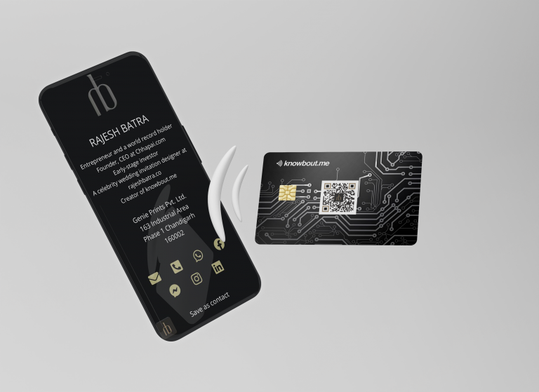
10 tips for your next business card design – Part 2

Banner-Text-White-2

Thank you for being tuned with us on this amazing journey to design you the perfect Business Card.

So we have selected the outline of your Business or Visiting Card.

Decide whether we want to indulge into the conservative side with a mere rounded edges of the business cards or the more explorative side where you can experiment with different styles through laser cut.

1. Adjust the measurements

The next step is to choose the size of your card. This is mostly dependent on the standard norm of the country.

COUNTRY – India

DIMENSION (inches) – 3.54’ × 2.165”

DIMENSION (millimeters) – 90mm × 55mm

Apart from the dimensions, there are a handful of pieces of information which can prove helpful for you while designing the card.

Bleed Area – This is the outermost part of the card & most likely to be removed.
Trim Line – This the intended line for cutting the cards.
Safety Line – Anything outside this line is subject to cutting mistakes. Don’t let any vital elements like text or logos fall outside this line.

Here are some standard size, a safe bet is listed below-

  • Set the trim line at 0.125 in. (3.mm) from the edge.
  • Set the safety line at 0.125 in. (3.mm) from the trim line
  • The total from the edge of the bleed area to the inside of the safety area is 0.250 in ( 6 mm).

2. Integrate your logo & other graphics

Now it’s time to begin with incorporating the visual elements of your business card design, first & foremost the logo.

Your Logo should be the nexus of the whole artifact.

Enhance it with secondary graphics which would in favor accentuate the design.

One must not forget there are two sides at their disposal.

One side should be used exclusively for the logo, while the other side discloses the basic information of the person. It is totally your choice. You could use the logo on both the ends, but on the other end the size of the logo should be minimal along with the contact information.

Usually people use this same strategy while designing their business cards, but feel free to explore & design the card to your satisfaction & need.

Mostly minimalism is the most popular choice while designing a visiting card but it doesn’t match your taste, you can find & fill it with additional graphics.

Suppose you are a florist and desire to design a card which is in sync with your brand, you could incorporate some visual elements which would help get along your message further in addition to a stunning card.

Additional graphical elements work well for afformately delivering the message about your brand. Without explicitly uttering a word, your message would be out there in the open.

You could communicate you & your brand’s personality through visuals, including the selection of the shade of the color.

If you want your brand to be casual & approachable you could always play with bright colors & even use any cartoon character for that matter if it serves the purpose.

A fun approach for designing your business cards can do the trick, if you are planning to make it friendlier and amicable.

It can be anything you want it to be. Play with colours, shades, elements & make it perfect.

Facebook
Twitter
LinkedIn
Pinterest