Case Studies
The Card That Spoke Before She Did: A Founder's Story
When architect Priya Malhotra handed her card across a boardroom table in Mumbai, the paper did something unexpected. It began the conversation for her.
The Moment the Paper Spoke
The boardroom on the fourteenth floor of a Nariman Point tower was the kind of room that had seen everything. Marble floors worn smooth by decades of negotiations. A long teak table that absorbed light rather than reflected it. Priya Malhotra, founder of a Pune-based architectural practice called Threshold Studio, had been here before in spirit, if not in body. She had rehearsed the pitch. She knew her numbers. She had dressed with the same quiet deliberateness she brought to every facade she designed.
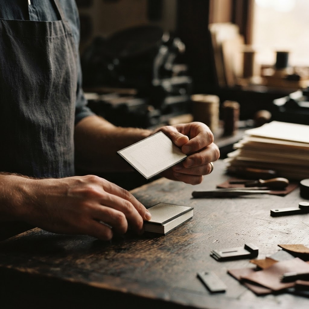
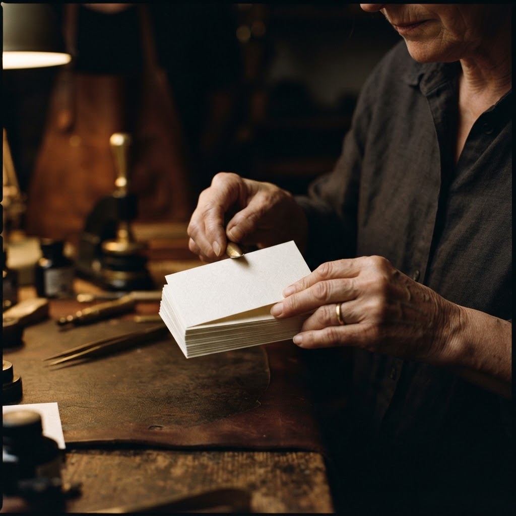
What she had not anticipated was the moment her card left her fingers and settled into the hands of the senior partner across the table. He did not glance at it and set it aside, the way one does with a card that is merely informational. He held it. He turned it once. His thumb moved slowly across the surface, as though reading something written in a language below language.
He looked up. "Where did you have these made?"
She told him. And then, for the next forty minutes, the conversation that followed was exactly the kind she had hoped to have, the kind built on the assumption that the person across from you understands what quality actually costs.
What a Card Must Carry
Priya had spent eleven years building Threshold Studio from a one-room office in Koregaon Park into a practice with seventeen people and a portfolio spanning residential towers, boutique hotels, and a handful of museum commissions that had begun to attract international attention. The work was rigorous, considered, and unmarked by trend. Her clients were not people who needed to be convinced of the value of design. They were people who already lived inside it.
And yet, for years, her business cards had felt like a contradiction. Printed on standard coated stock, carrying a logo she was proud of but rendered in a format that flattened it, they communicated competence. Nothing more. In a practice where the entire argument rested on the proposition that form and material are inseparable, her most portable piece of communication was betraying her.
"I design buildings where the texture of the wall is a decision," she told us when we spoke to her earlier this year. "Where the weight of a door handle tells you something about how seriously we took the room. And then I was handing people a card that felt like it could belong to anyone."
She came to Chhapai in the autumn of 2022, referred by an interior designer whose foil-stamped cards she had admired at a furniture fair in Milan. She arrived with her brand guidelines, her logo files, and a very clear brief. She wanted something that communicated precision. She wanted restraint, not minimalism for its own sake, but the kind of restraint that implies everything has been considered and nothing has been left to accident. And she wanted the paper itself to do some of the work.
The Paper from Another Tradition
What Iridesse Pearl Is, and Where It Begins
When our atelier recommended Iridesse Pearl, we were drawing on a material that carries its own history. The paper originates from Italy, from mills operating within a stationery tradition that stretches back centuries, to a time when paper was understood as a primary material rather than a substrate. Italian fine paper culture is rooted in the idea that the sheet itself is the first impression, that what the hand feels before the eye reads establishes everything that follows.
Iridesse Pearl is made from pulp fiber, the long-chain cellulose that gives fine papers their structural memory. Unlike wood-pulp sheets pressed thin and coated to a high gloss, this paper breathes. It has what papermakers call formation, a slight, even variation in density across the sheet that catches light differently depending on the angle. The finish is smooth, but not in the way of a laminated surface. It is smooth the way river stone is smooth, with depth beneath it, with evidence of process.
The pearl quality is not a coating applied afterward. It is inherent to the fiber itself, a luminosity that shifts from warm ivory in direct light to a cooler, almost silver-grey in shadow. Hold a card made from this paper near a window in the late afternoon and you will see what we mean. It does not perform. It simply is.
How We Work With It at Chhapai
At our Jaipur atelier, Iridesse Pearl presents particular pleasures and particular demands. Because the surface has genuine tooth, even at its smooth grade, it holds ink with a fidelity that coated stocks resist. The colors sink in slightly rather than sitting on top, which means the black of Priya's wordmark, a geometric letterform she had refined over three years with a type designer in Amsterdam, printed with a depth that felt almost three-dimensional.
For Threshold Studio's cards, we worked with a single-weight application of her charcoal grey across the reverse, and her name and details on the front in a fine sans-serif at a size that required the paper's smoothness to hold cleanly. No foil. No embossing. The design decision was to let the paper be the statement, and to trust that the person receiving the card would feel the difference before they understood it.
This is a discipline we return to often at Chhapai. The most confident design choices are frequently the quietest ones. A paper like Iridesse Pearl rewards that confidence. It does not need to be decorated to be extraordinary. It asks only that the work placed upon it be worthy of its own restraint.
What Changed
Priya placed her first order of two hundred and fifty cards in November of 2022. She has reordered four times since. That alone tells a story, but the details tell a better one.
Within three months of receiving her cards, she noticed something she had not expected. People were keeping them. Not in card holders, necessarily, but on desks. On top of notebooks. In the outer pocket of a wallet where they could be retrieved without searching. A developer she had met at a site walk in Bandra called her six weeks after their introduction. He opened by saying he had been meaning to reach out, that he kept seeing her card on his desk and kept thinking about the project they had discussed. She got the commission.
"There is something about a card that stays in someone's peripheral vision," she said. "It becomes part of their environment. And if it's beautiful enough to stay there, it keeps doing its work."
Her team noticed a shift as well. When junior architects at Threshold Studio were given the new cards to carry to site visits and client introductions, something changed in how they presented themselves. The card, they told her, made them feel more serious about the practice they were representing. This is not a small thing. The material culture of a studio extends to its people, and a beautiful card handed over with confidence is a form of training in how the firm wishes to be perceived.
At the Nariman Point meeting, the one that opened this story, Threshold Studio was awarded a commission for a mixed-use development in the Bandra Kurla Complex. Priya does not attribute this to a business card. She is too rigorous a thinker for that. But she will say, with some precision, that the card created a quality of attention in the room that her previous cards had not. That it established, before a single slide was shown, that this was a practice for which details were not afterthoughts.
A Final Thought on What We Leave Behind
There is a long tradition, in India and in Italy both, of understanding that the objects we make to represent ourselves should be made as carefully as the work itself. A visiting card is not a formality. It is the first physical object that carries your name into someone else's world. It will sit on their desk or be slipped into their pocket or rest in a drawer for months before they call. It will, in some small but real way, continue to make an argument on your behalf long after you have left the room.
Priya Malhotra understood this. She understood it the way an architect understands that the material of a threshold, the very first surface a visitor touches when entering a building, is never a neutral choice. At Chhapai, we have understood it since 2006. And we remain, as we have always been, in the quiet business of making sure that when your card is held by the right person at the right moment, it says exactly what you meant it to say.