Case Studies
When the Card Speaks First: A Founder's Story of Flatbed UV
When architect Riya Mehra handed over her first Chhapai card at a Mumbai pitch meeting, the room paused. This is the story of why that moment mattered.
The Moment Before the Conversation
The conference room on the fourteenth floor of a Bandra Kurla tower smelled of cold air conditioning and fresh coffee. Riya Mehra, founder of Studio Mehra, an architectural practice specialising in high-end residential design, had flown in from Ahmedabad that morning. She had twelve minutes to introduce herself before the slides. She set her portfolio on the table, opened her mouth to speak, and then, almost as an afterthought, slid her business card across the glass surface toward the client.
The client, a developer known for building homes in the seven-crore-and-above bracket, picked it up. He did not put it down again for nearly a minute.
The card was printed on a thick, bone-white cotton stock. Across its face, her studio name rose in a subtle, glass-like layer, catching the overhead light differently depending on the angle. Run a fingertip across it and you felt the texture shift, smooth where the paper breathed, then slightly raised and almost cool to the touch where the UV coating had settled into her logo. It was a small thing. It was not a small thing at all.
"I have seen a lot of cards," the developer said, finally. "I have not seen one like this."
The pitch lasted forty minutes. Studio Mehra was commissioned that afternoon.
What a Card Must Carry
Riya had founded her studio in 2019, peeling away from a larger firm in Ahmedabad where she had spent eight years drawing other people's visions. Starting alone meant she was, for a time, both the creative director and the person answering her own calls. The early years were disciplined, sometimes lean, and always deliberate. She chose her clients carefully. She wanted her practice to carry a particular feeling, something spare and precise but never cold, luxurious but never ostentatious.
The trouble was that her early branding did not match that intention. A well-meaning designer had handed her a card on standard 350 GSM art paper with a matte laminate. It was adequate. Architects hand over adequate cards every day, and adequate cards are forgotten in jacket pockets by the weekend.
"The card was the first physical object someone held from my studio," she told us when we sat with her in Ahmedabad earlier this year. "If that object felt generic, why would they believe the work would feel otherwise?"
She needed a card that communicated precision without aggression, texture without noise, and a quiet confidence that the practice had taste before it opened its mouth. She found Chhapai through a recommendation from a furniture designer in Jaipur who had used our letterpress work for her brand refresh. Riya called us, described what she was looking for, and we talked for a long time about Flatbed UV.
The Craft of Flatbed UV at Chhapai
What the Process Actually Involves
Flatbed UV is one of the more quietly demanding specialities in our atelier. The name is practical rather than poetic, referring to the flatbed press on which a liquid UV-curable coating is applied directly to the surface of a printed card. But the result, when it is done with care, is anything but clinical.
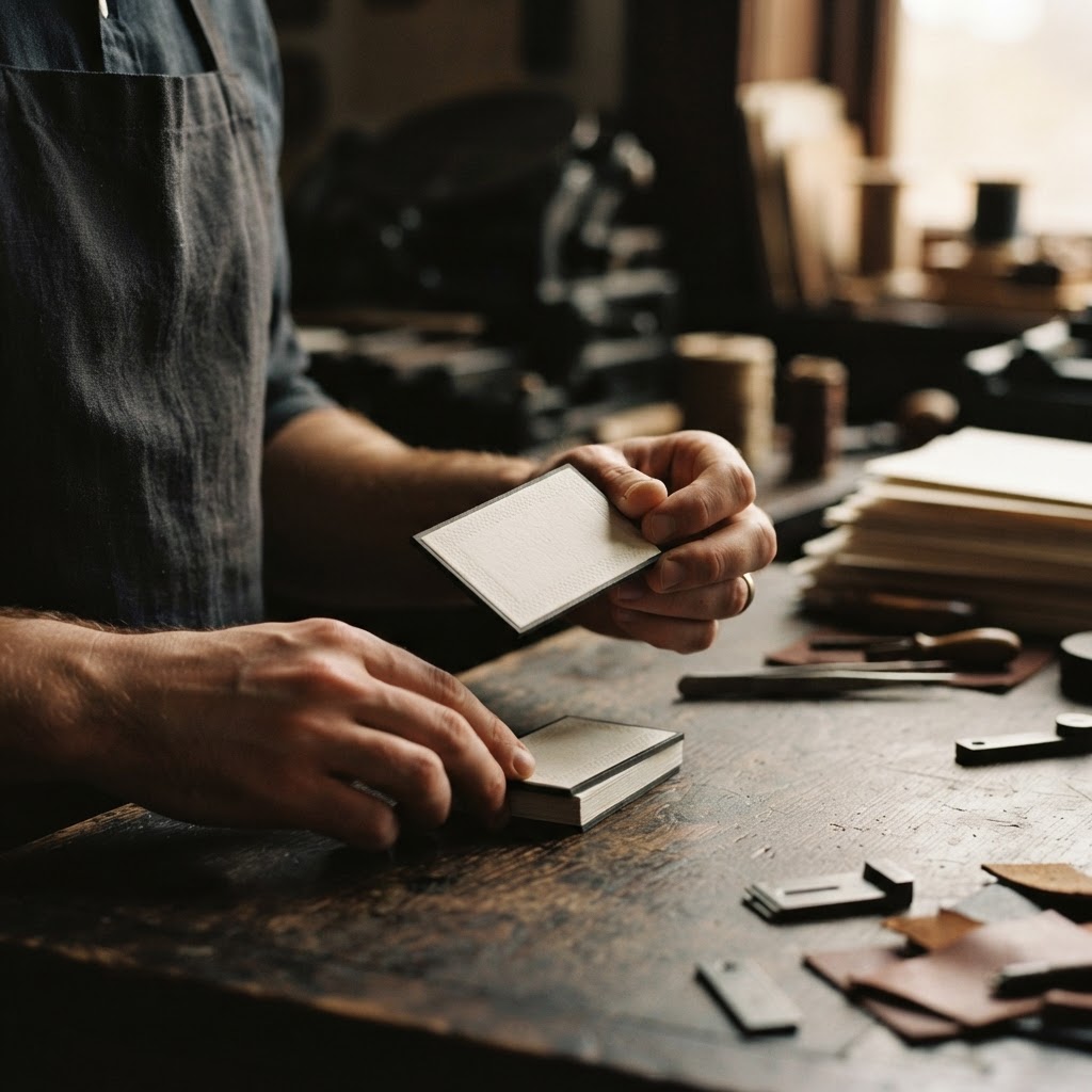
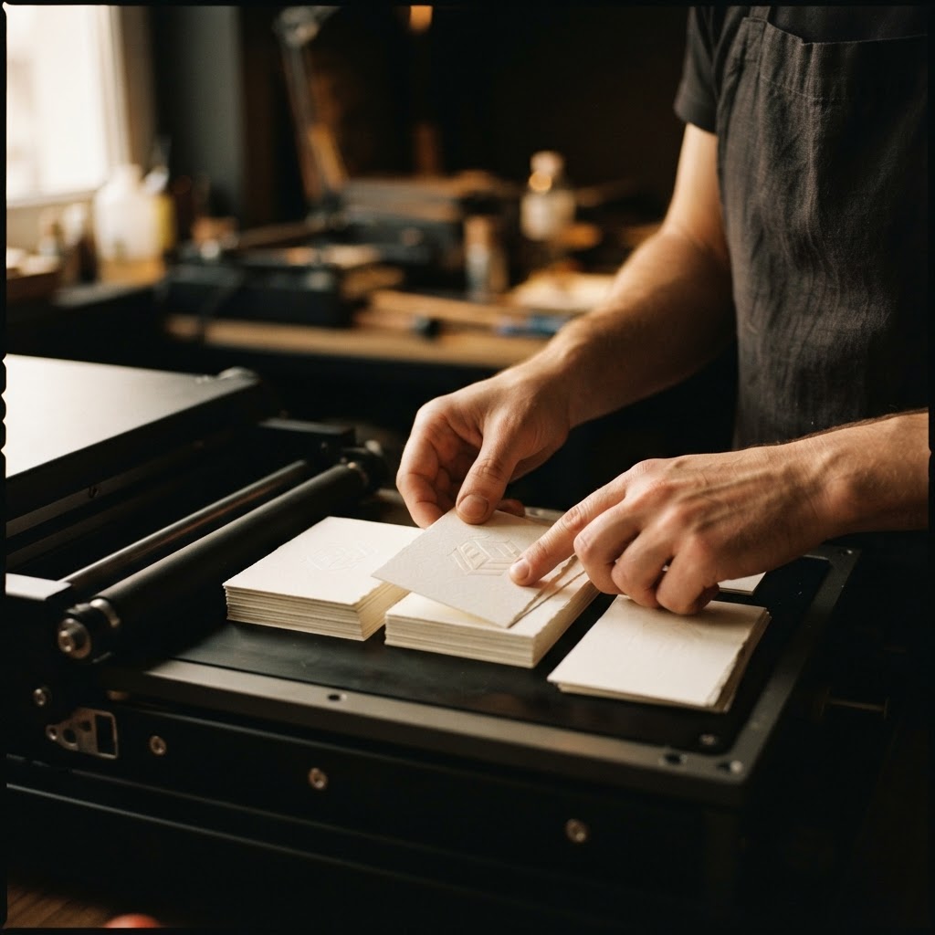
At Chhapai, we begin with the substrate. For Riya's cards, we selected a cotton rag stock, the kind that has a slight tooth to it, a faint resistance when you draw your thumb across the blank face. Cotton paper does not behave like wood-pulp stock. It absorbs differently, holds ink with more depth, and ages without yellowing. It was the right foundation for what we intended to build on top of it.
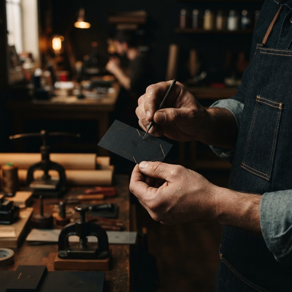
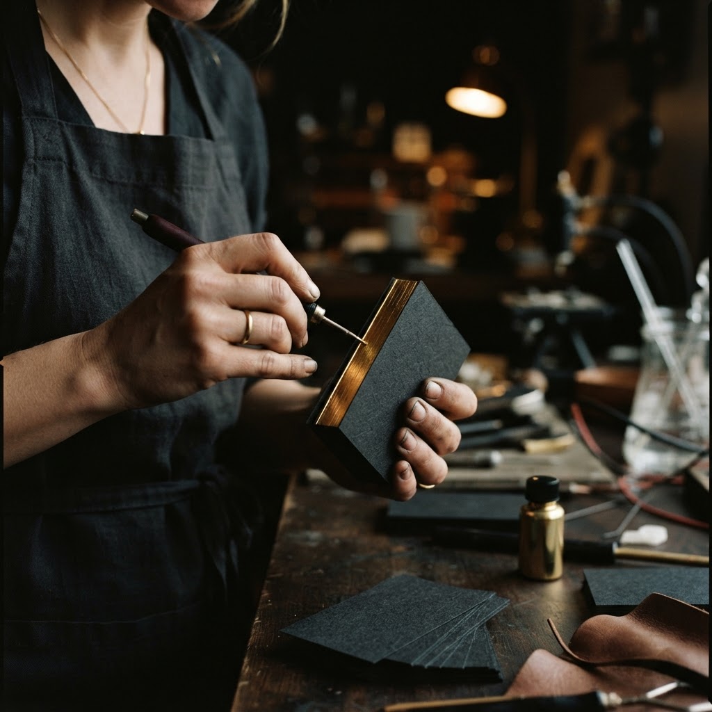
The offset base layer is printed first, carrying the design elements in their flat form. Then the card goes to the Flatbed UV station. Here, a clear or tinted UV resin is applied through a precision screen onto only the areas specified in the artwork file. For Riya's card, this meant her studio name and a fine architectural grid motif that ran along one edge. The resin sits wet for a moment, then passes under a UV lamp that cures it almost instantly, locking it into a raised, glassy layer.
The thickness of that layer matters enormously. Too thin and the tactile quality is lost, it reads as a sheen rather than a presence. Too thick and it can crack at the card's edges over time, or look heavy-handed, more promotional than refined. Our press operators have spent years calibrating this, adjusting viscosity with the season, since humidity in Jaipur shifts considerably between July and December, and what cures beautifully in a dry winter month will behave differently in the monsoon weeks. This is the kind of knowledge that does not live in a manual.
Spot UV Versus Flood UV, and Why the Difference Is Everything
It is worth pausing here on a distinction that matters to any founder considering this process. A flood UV coating covers the entire card surface uniformly, creating a consistent gloss. It is handsome and protective, and has its place. Spot UV, which is what Riya chose, applies the coating only to designated elements, so that the tactile contrast between coated and uncoated areas becomes part of the design itself. When someone holds her card, their fingers move from the soft, slightly fibrous cotton surface directly into the elevated coolness of her logo. That transition is the experience. It is designed texture, not incidental finish.
At Chhapai, we treat the artwork file for a spot UV project the way a jeweller treats a setting. The placement of each coated element is considered in relation to what surrounds it. Where should the eye be drawn first. Where should the finger land. What impression should be left after the card has been placed on a table.
"I kept thinking about the word 'considered'," Riya told us. "When someone holds that card, I want them to feel that every decision in my work has been considered. The card had to do that in three seconds."
What Changed After the Cards Arrived
The first box of three hundred cards arrived at Riya's studio on a Tuesday morning in late 2022. She has described opening it as one of the stranger professional moments of her recent years, not because anything dramatic happened, but because the cards were exactly what she had imagined, and that almost never happens with printed material. There was no gap between intention and execution.
She began carrying them everywhere. Not distributing them carelessly, she is deliberate about this, but handing them to the right people at the right moments. A structural engineer she was hoping to bring onto a project. A lighting consultant at a trade event in Mumbai. A potential client referred by a builder in Surat.
The responses were consistent in a way she had not fully anticipated. People commented on the card before they commented on anything else. Not in an effusive way. More often in the quiet, slightly puzzled way of someone trying to understand why an object feels different from others of its kind. Several asked where it had been made. One client, a retired surgeon building his retirement home in Alibaug, kept the card on his desk for two weeks before calling to commission the project. He mentioned the card when he called.
A referral pattern also emerged. Three of the clients she met in the year following the card's introduction came through people who had received the card, held it, and mentioned it when recommending her practice to someone else. A business card had become a referral object, something passed between people with a small story attached. "You should speak to Riya. She gave me this card."
Within eighteen months of the rebrand, Studio Mehra's project pipeline had shifted meaningfully upward, both in project scale and in the quality of the initial enquiry. Riya is careful not to attribute this to any single cause. Her work had also matured. Her portfolio had grown. But she believes, and we believe, that the card was part of a coherent signal. A client encountering Studio Mehra for the first time received the same message at every point of contact. The card was simply the first object that delivered it.
The Quiet Argument for Getting This Right
There is a version of this story that treats the business card as a small vanity, a nicety for people who care too much about surfaces. We would gently disagree. What Riya understood, and what we have seen confirmed across nearly two decades of working with founders and creative professionals, is that the objects we put into other people's hands carry weight that we do not always consciously register but always feel.
A card made with intention, with the right stock and the right process and the right calibration of texture and restraint, does not shout. It does not need to. It simply arrives in someone's hand and tells a brief, accurate story about the person who made it.
Studio Mehra's card tells that story in cotton and cured resin, in the contrast between a soft ground and a glassy raised surface, in the fraction of a second it takes for a developer in a Bandra Kurla conference room to decide he has not seen one like this before.
That fraction of a second is worth every consideration.